SAO Guest Contribution

SAO Guest Contribution |
|
A Recipe for Cooking Up Astronomical Images
Jayanne English
Jayanne English currently enjoys the teaching and research activities associated with being an Assistant Professor in the Department of Physics and Astronomy at the University of Manitoba in Winnipeg. Her forte' is creating colour outreach images from astronomy data and currently she is enjoying working with radio images, like the Cygnus Region, as part of her research work as a member of the International and Canadian Galactic Plane Survey (I/CGPS) .
Before her graduation from the Ontario College of Art (1984), she had already begun the B.Sc. program in astronomy at the University of Toronto. Her Ph.D. adventure was under the starry skies "down under" at Mount Stromlo & Siding Spring Observatories in Australia, under the supervision of Ken Freeman. After her Ph.D. in astronomy and astrophysics was granted in 1994 from the Australian National University, she enjoyed the Canadian snows and two enriching post-doctoral fellowships, with Judith Irwin, at Queen's University. Then Jayanne had an unusual post-doctoral fellowship at the Space Telescope Science Institute (STScI; 1998-2000). In addition to doing research, she coordinated the Hubble Heritage project, authored the Hubble Heritage website and contributed to the creation of Hubble Heritage color pictures of astronomical objects.
Jayanne's research interests include the behaviour of gas in groups of galaxies that are interacting with each other, and the how mass and energy are exchanged between a galaxy's spiral disk and its halo. In particular she is obsessed with the I/CGPS data showing a mushroom-shaped cloud bursting more than 1000 light-years out of the plane of the Milky Way.
Bold colour images from telescopes act as extraordinary ambassadors for astronomers because they pique the public's curiosity. But are they snapshots documenting physical reality? Or are we looking at artistic space-scapes created by digitally manipulating astronomy images? In my view, each image is a battlefield where the attempts by scientists to represent their discoveries all but drowns out the voice of visual literacy, smothering the colour and composition clues we usually use to read images. Fortunately, sometimes in this battle between the cultures of science and visual art, both sides win. An image is produced that simultaneously contains scientific meaning and is visually engaging.
Astronomy images are not snapshots and, if you define "true colour" as what you would see with the human eye, none of them are true colour. Nevertheless they are often maps of the true physical processes occuring in outer space and they represent some intrinsic qualities of the stars, galaxies, planets, and gas clouds that are in the image. Such maps are not fanciful space-scapes. However image editting is involved since monochromatic data from telescopes must be combined together in order to create colour images. That is, data (e.g. exposures onto a digital camera) are collected of the same astronomical vista but each set of data is collected using radiation from a different, selected wavelength range of the electromagnetic spectrum. Since each dataset appears black and white to our eye, we need to assign a colour to each dataset and then add the coloured, yet still monochromatic, images together in order to produce one multicolour image. This visualization of the data consists of 4 main stages.
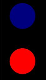
 This
visualization of monochromatic data presents both technical and artist
challenges to the astronomy image-maker. For an idea about how colour
and composition play a role in any image, consider the red and blue
circles. Which one jumps forward? Does one look bigger? They are both
the same size. (The red one, right?)
This
visualization of monochromatic data presents both technical and artist
challenges to the astronomy image-maker. For an idea about how colour
and composition play a role in any image, consider the red and blue
circles. Which one jumps forward? Does one look bigger? They are both
the same size. (The red one, right?)
So given a set of black and white astronomy data, and knowing that warm colours such as red jump forward, how would one assign colours to individual datasets to impart a 3-dimensional feel to the final image? Here's an example of such a challenge, faced by the Hubble Heritage team. In the data images of Hodge 301 we see that this star cluster seems to be embedded in heated gas. The goal is to make the star cluster appear to sit in front of some of this gas.
That is just one example of how we visually read images. However the rest of this website focuses on the technical challenges of making astronomy images. Perhaps you are looking for a recipe so that you can make your own images? This site presents an overview of the way monochromatic data from telescopes are combined together along with instructions for using visualization tools.
In relation to this topic, you can also read Mike Bessell's guest contribution from Semester 1 1999 on Colour imaging with a CCD.